Publication Design · Bilingual Zine · 2023
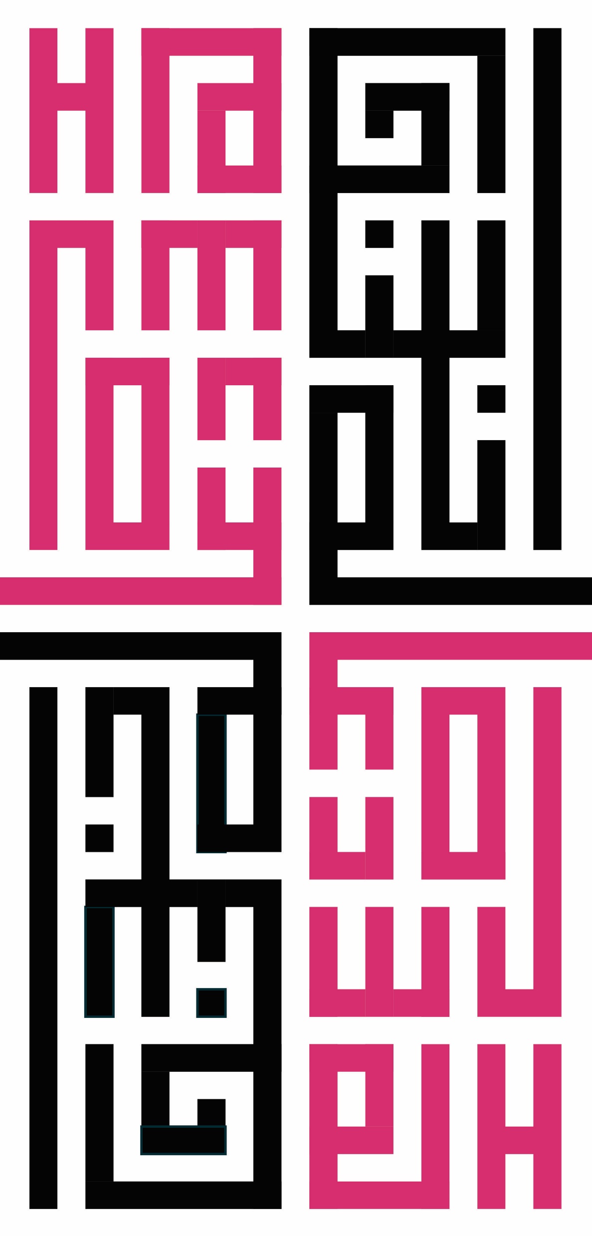
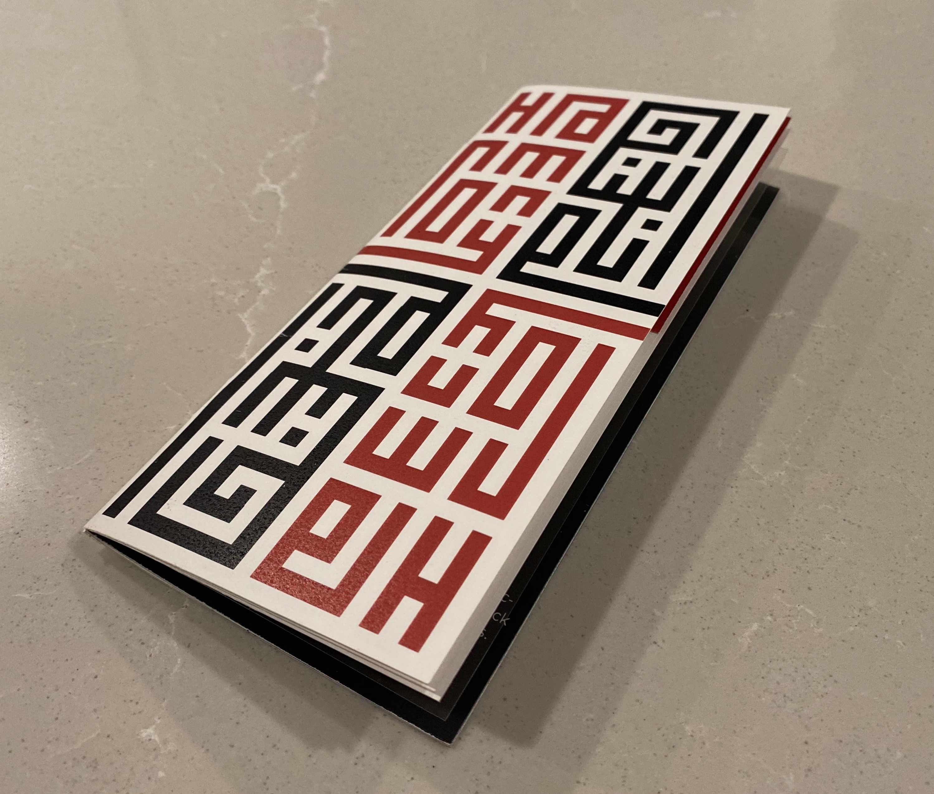
Harmony

انسجام

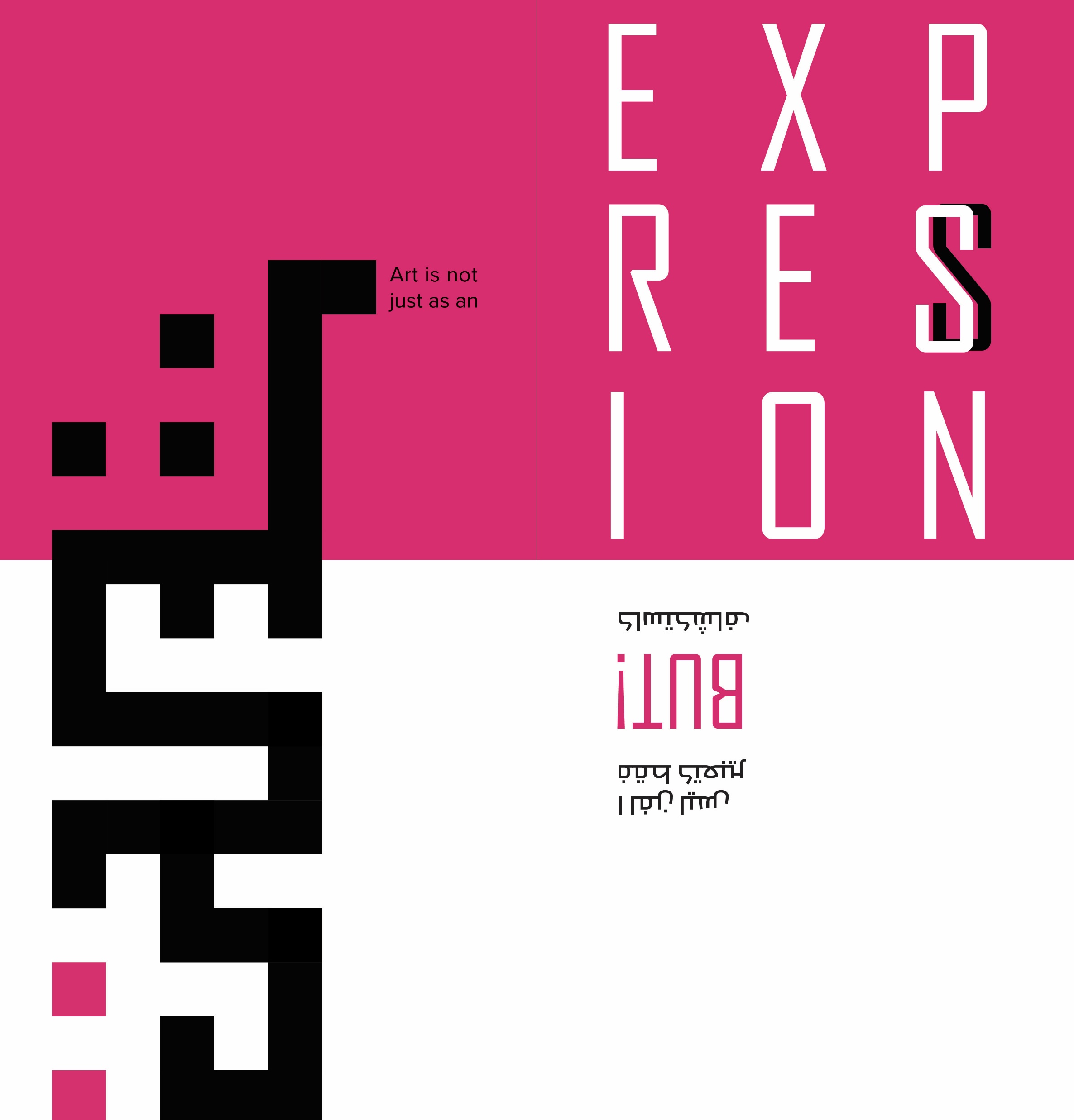
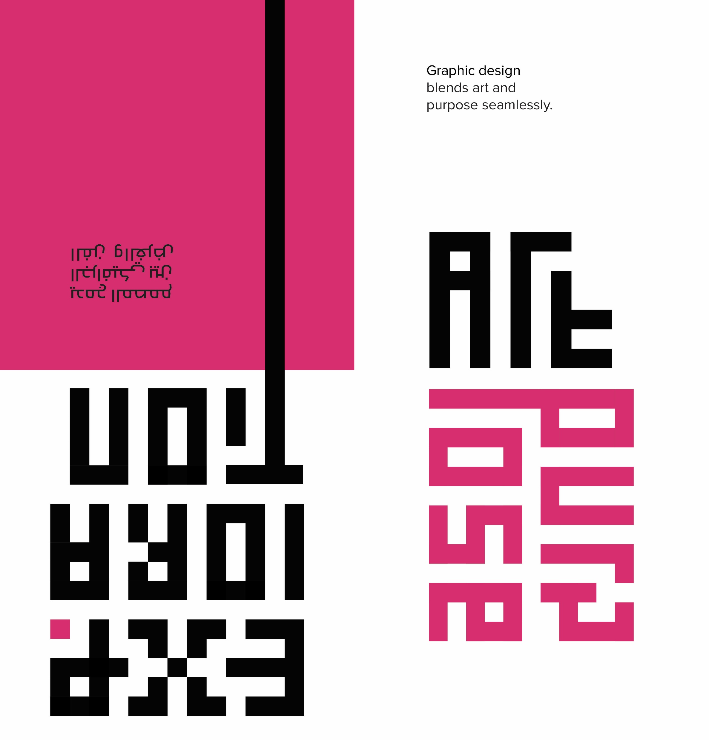
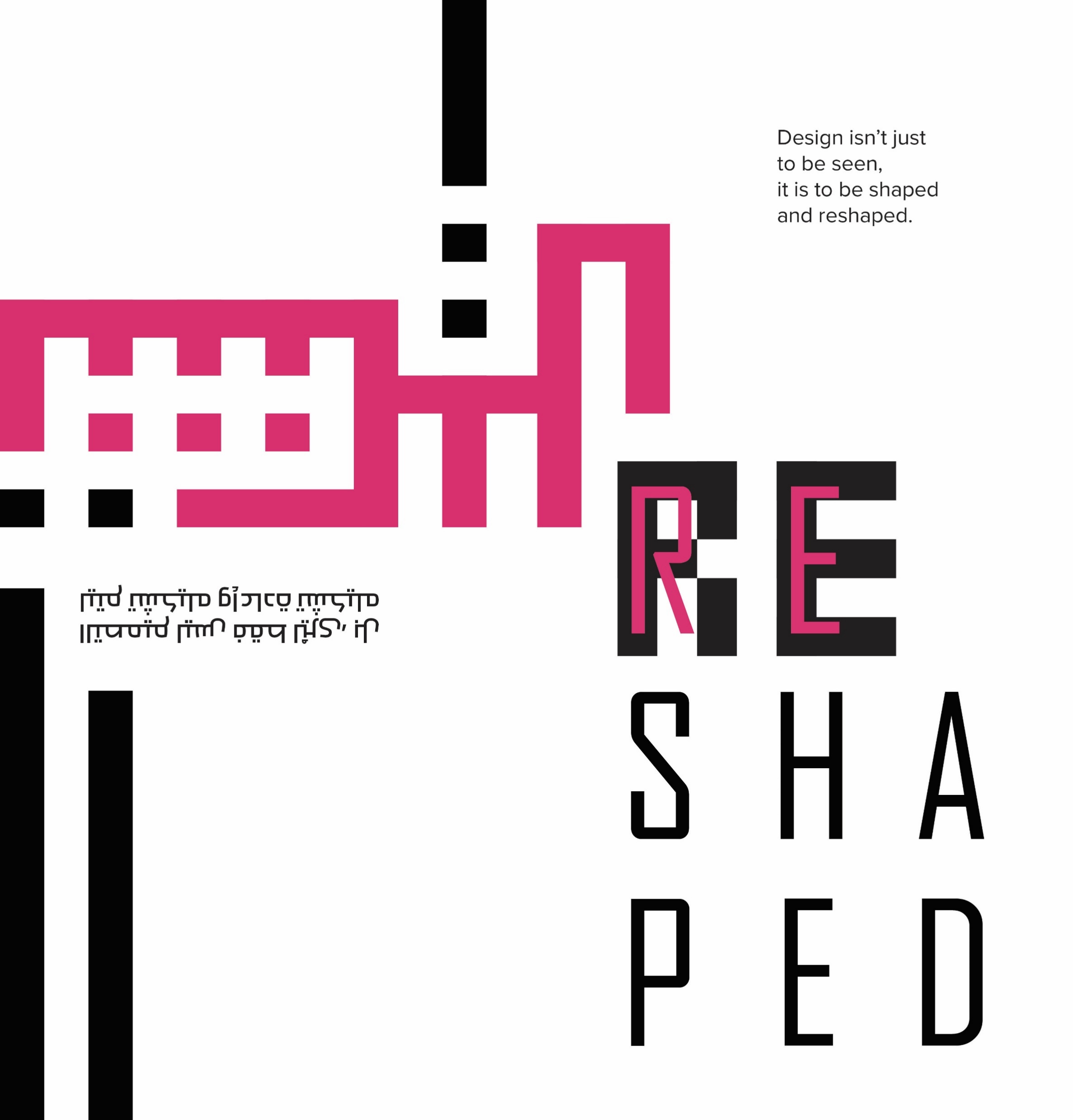
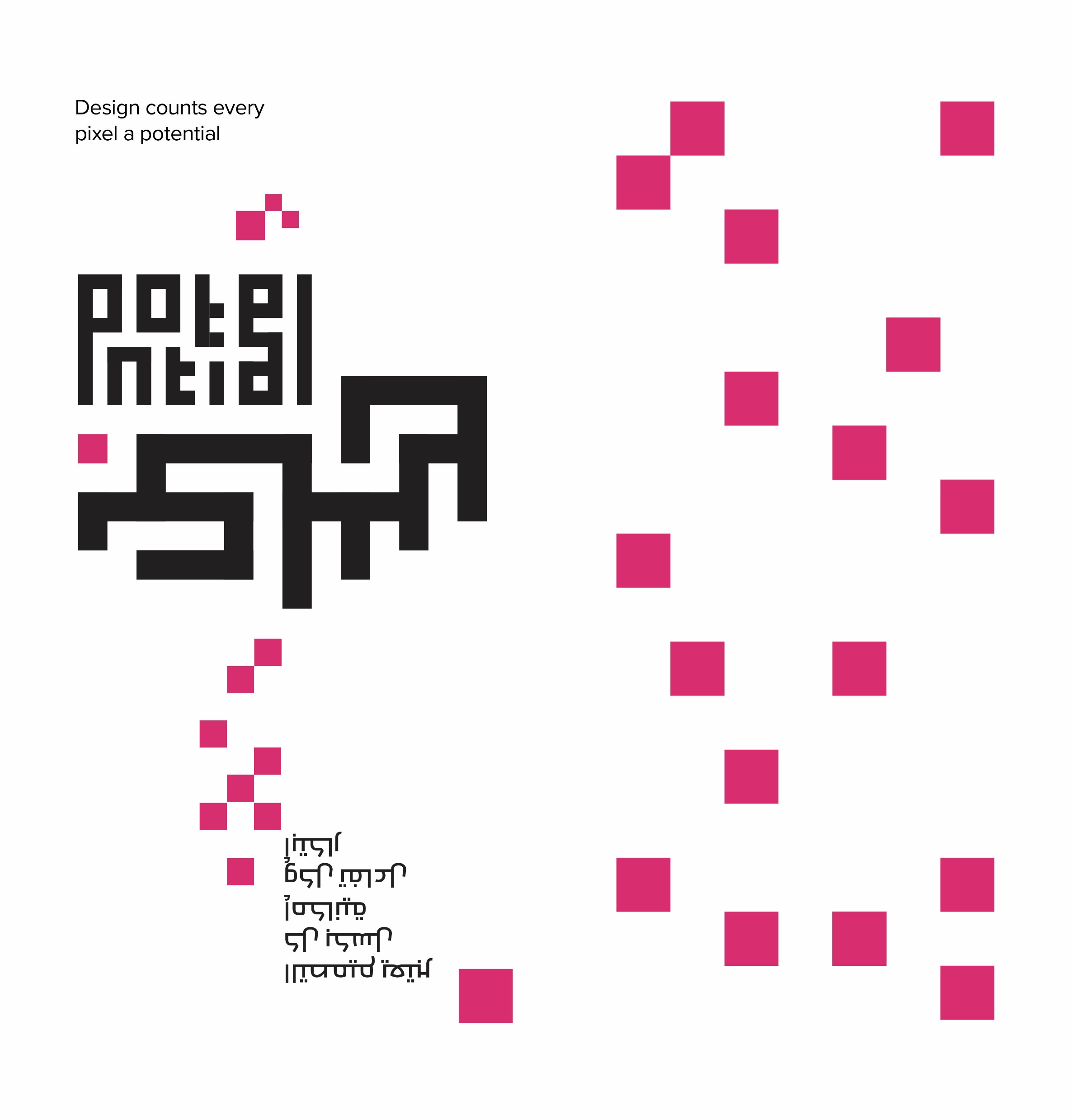
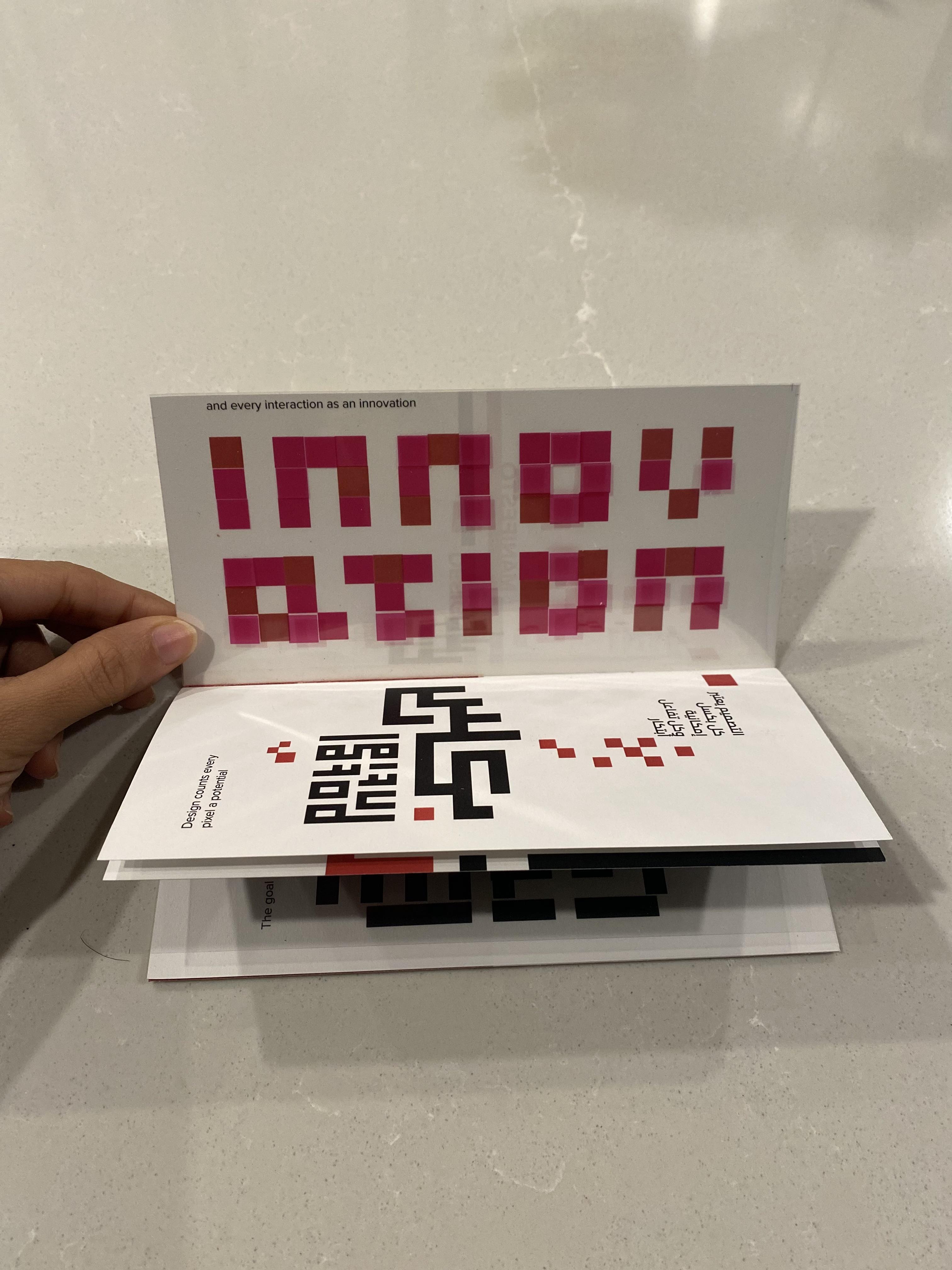
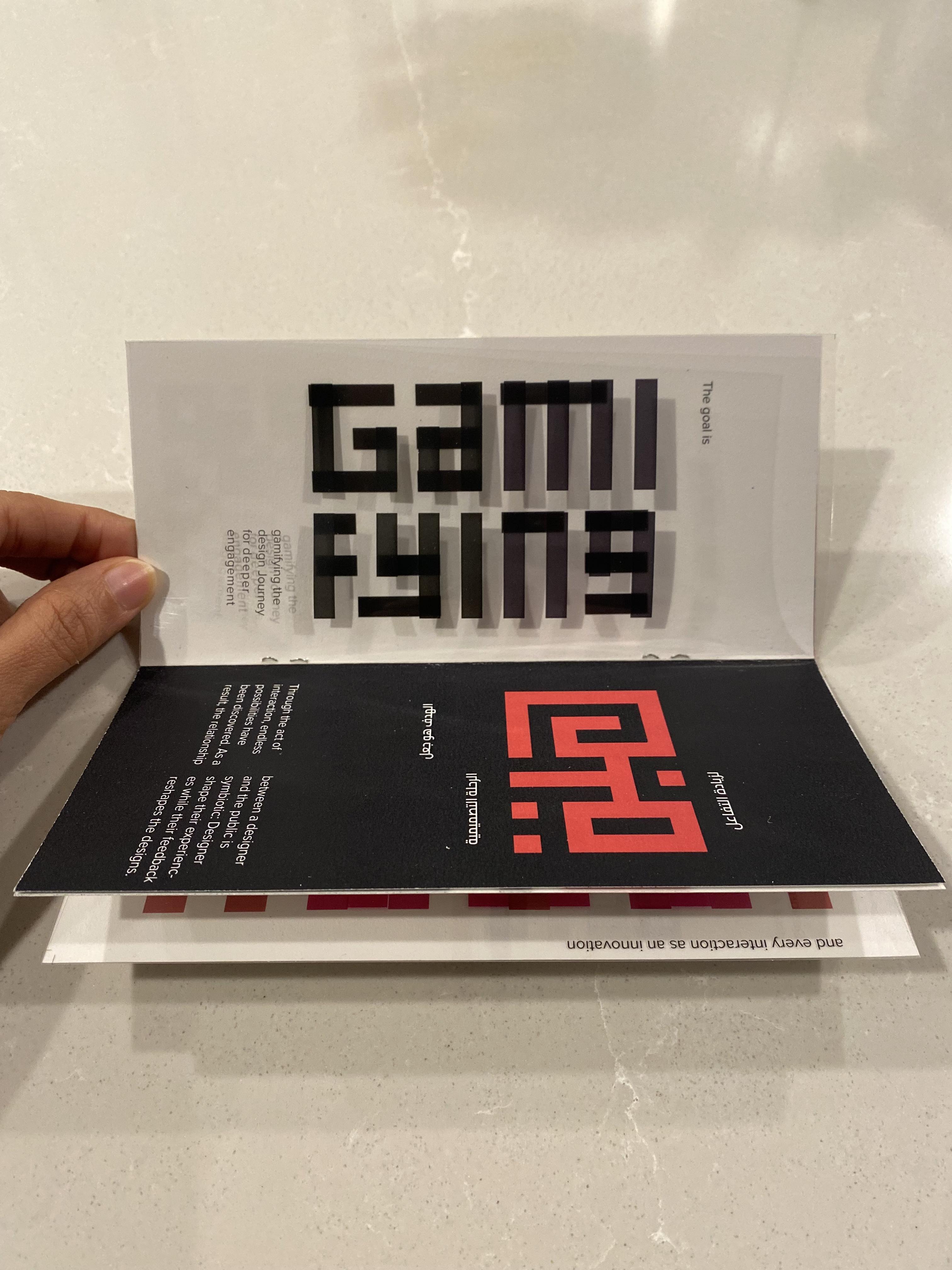
A bilingual manifesto zine — English one way, Arabic the other — where Kufic geometry meets Latin letterforms and transparent pages turn reading into an act of interaction.

2Languages
KuficArabic Style
RisoPrint
Harmony zine spread — Kufic Arabic design and manifesto typography
01 — Concept

Two cultures, one book

As an international student from a different culture — Egyptian Arabic — I've been drawn to projects about how culture shapes people's thinking and outlook on life. My goal isn't just to highlight cultural diversity but to blend American and Arabic cultures in my designs, promoting inclusivity through form rather than just message.

Harmony is my manifesto publication print. The process began with writing my design manifesto and selecting the most significant points for the publication's content. The design is built on Kufic Arabic style, with every page focused on the interaction between Arabic and English narratives.

The unique feature of this zine is that readers can engage with it in two ways: read it in English in one direction, then flip it upside down to read the Arabic version from the right side. The manifesto mainly discusses the appeal of interactive design — so to emphasize that idea, some pages incorporate transparent paper, building the content in layers you have to interact with to fully see.


02 — The Manifesto

What the book says

Art is not just an expression but an exploration. The graphic designer blends art and purpose seamlessly. The goal is gamifying the design journey for deeper engagement — because through the act of interaction, endless possibilities have been discovered.

The relationship between a designer and the public is symbiotic: designers shape their experiences while their feedback reshapes my designs. So, to bring about real change, you have to prioritize the human experience. Therefore, I define the design as follows:

  1. Design isn't just to be seen — it is to be shaped and reshaped.
  2. Design counts every pixel as a potential, and every interaction as an innovation.
  3. Design, in its essence, should always prioritize human experience over mere profit.

03 — The Spreads

Kufic geometry as layout

Every spread is constructed around square-Kufic Arabic blocks paired with Latin typography, in a two-color palette of magenta and black. The Arabic script becomes pattern; the English type becomes counterpoint.

Harmony spread 1
Harmony spread 2
Harmony spread 3
Harmony spread 4
Harmony spread 5
Harmony spread 6
Harmony spread 7
Harmony spread 8
Harmony spread 9

04 — In Print

The object itself

Photographed in hand — transparent pages overlay the next, so pulling one back reveals the Kufic block hidden beneath. The zine only fully reads when you touch it.

Printed Harmony zine open showing INNOVATION spread
Printed Harmony zine closed showing Kufic cover
Printed Harmony zine open showing GAMIFYING spread

05 — Project Details

Scope & craft

TypePublication design, design manifesto zine
Year2023
LanguagesEnglish & Arabic (flip-book)
ScriptSquare Kufic calligraphy style
MaterialsPaper + transparent overlay sheets
PrintRiso print, black & magenta
ContextCultural identity, interactive publishing
RoleWriter & designer

Explore More Work

See the full portfolio or discover other publication & design projects.

All Projects View Type Classification