Publication Design · Typography · Riso Print · 2022
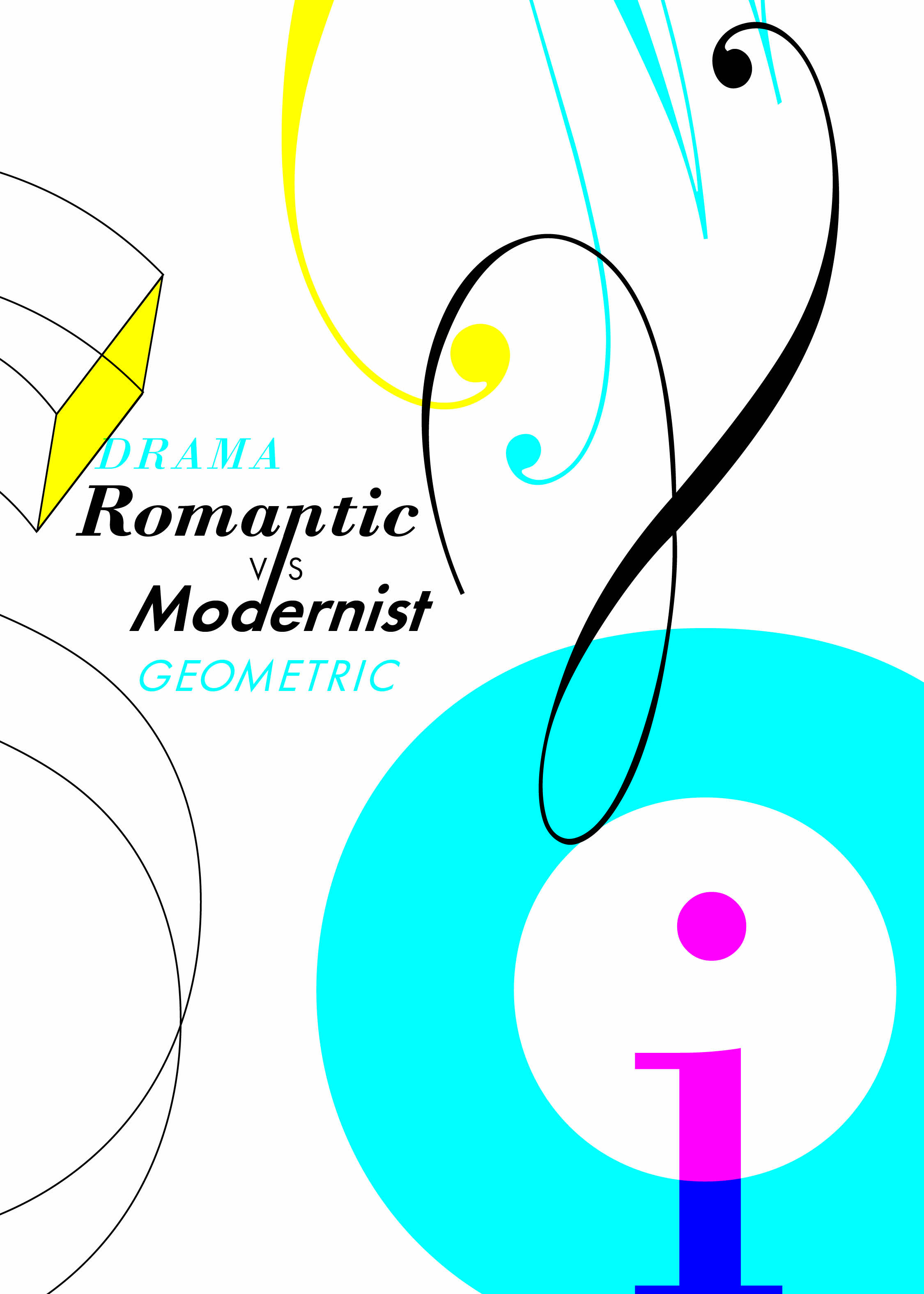
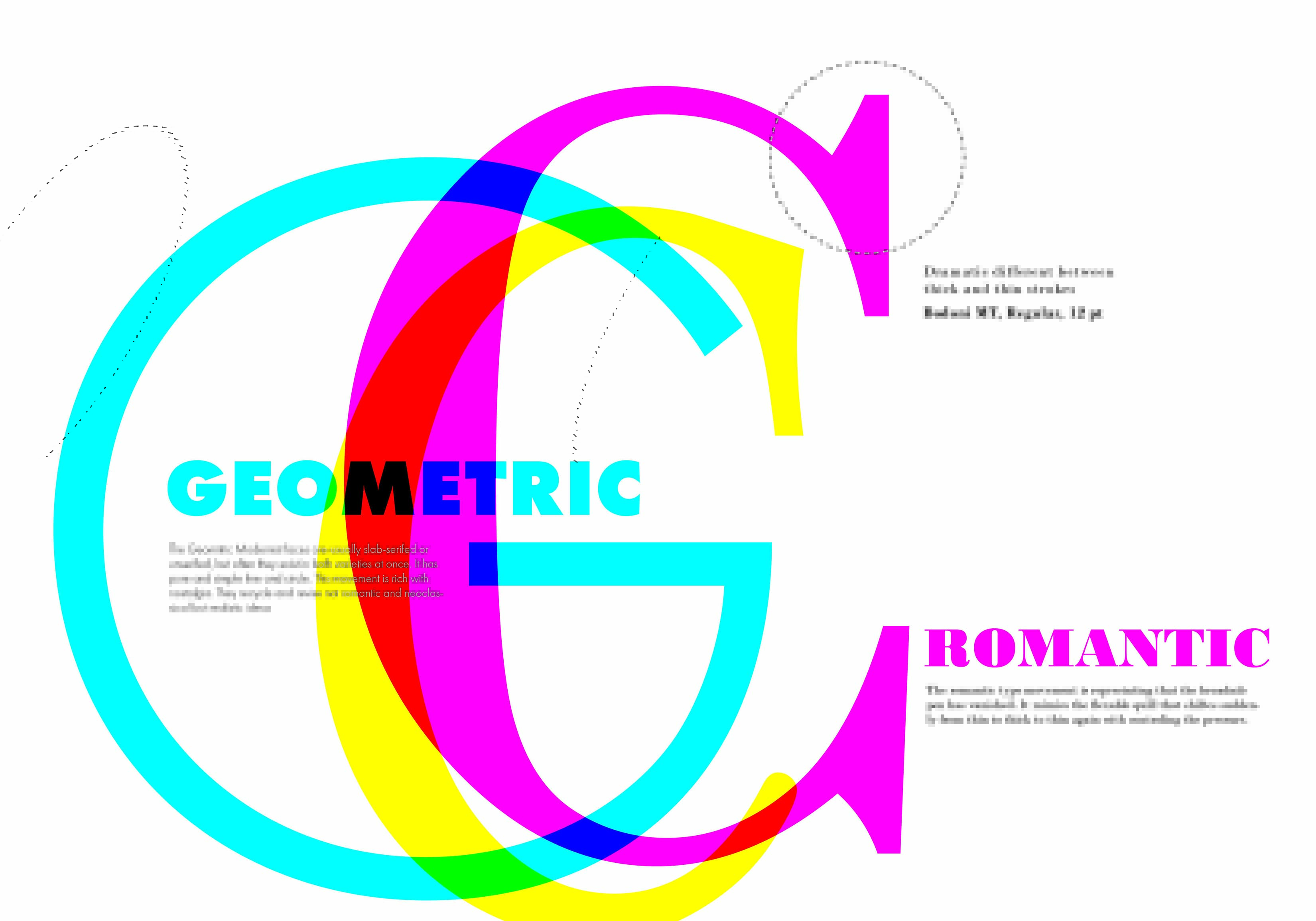
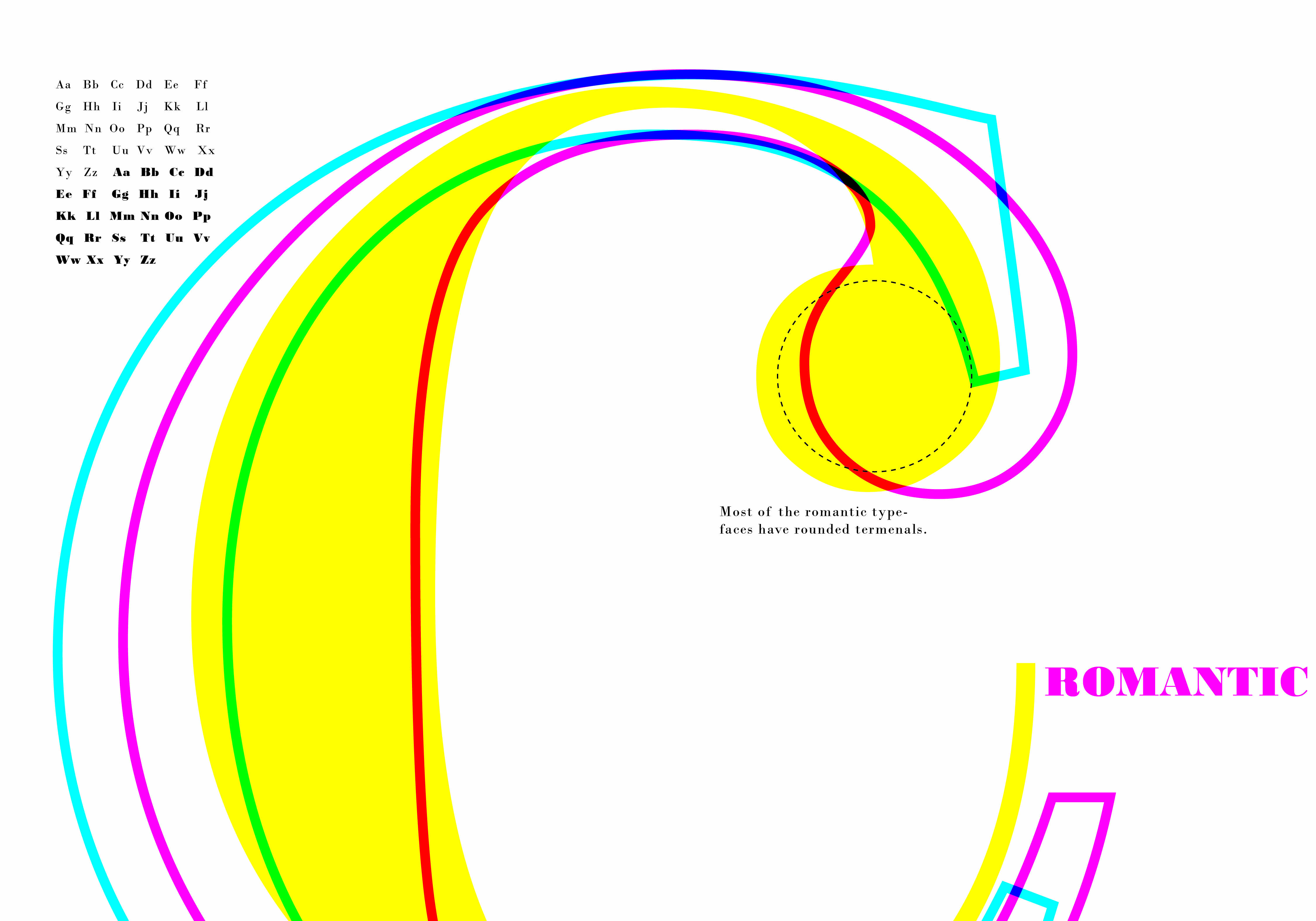
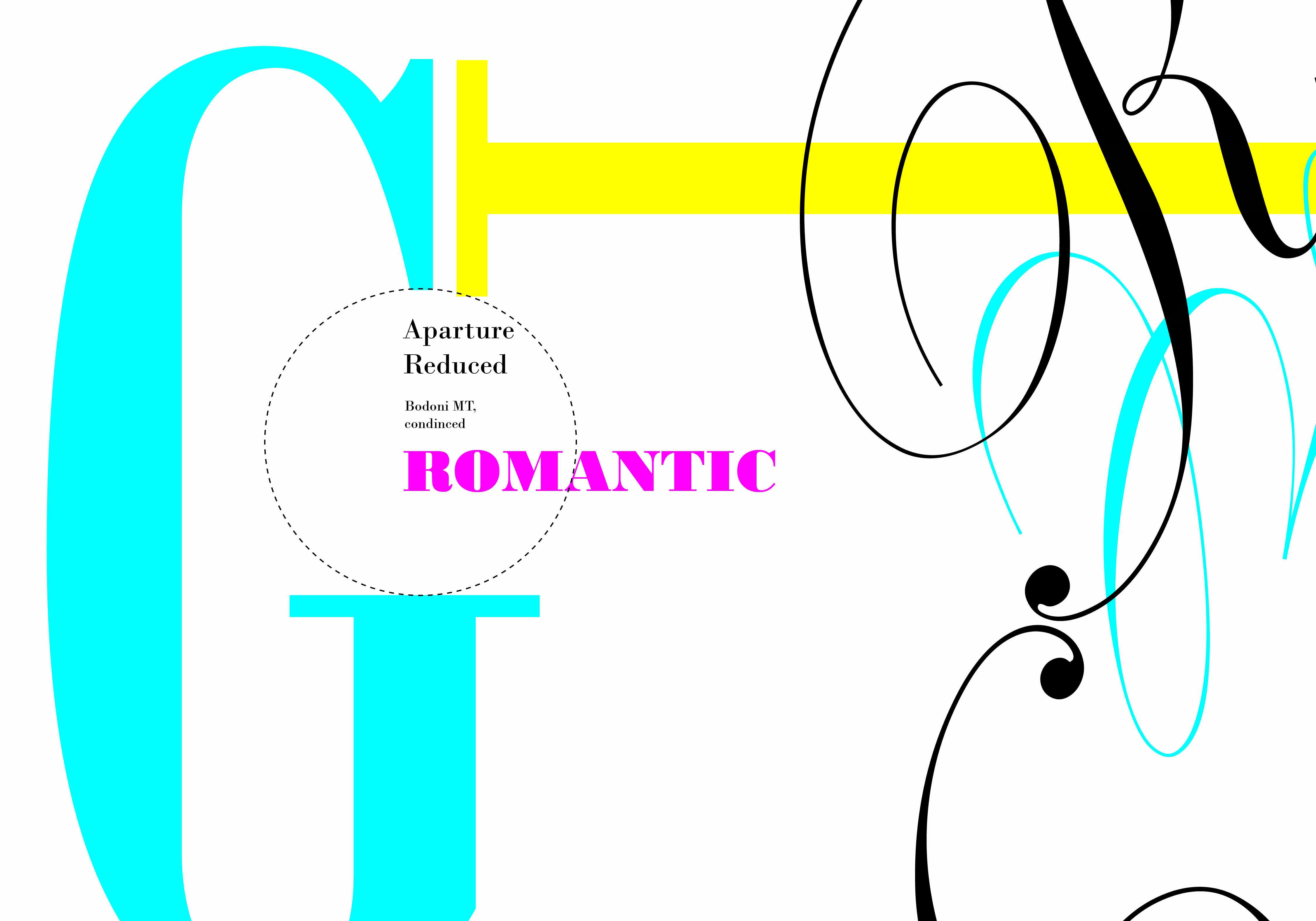
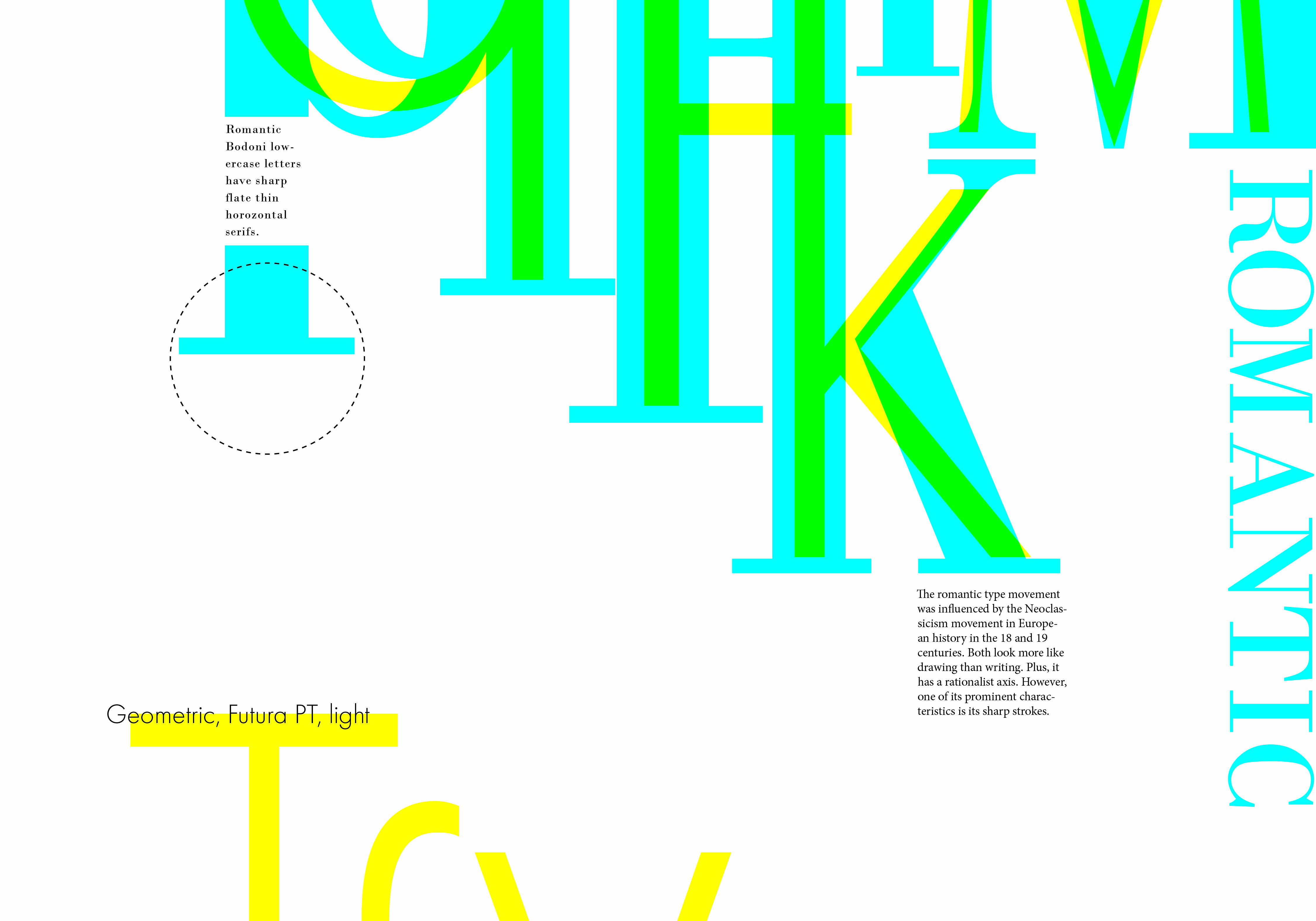
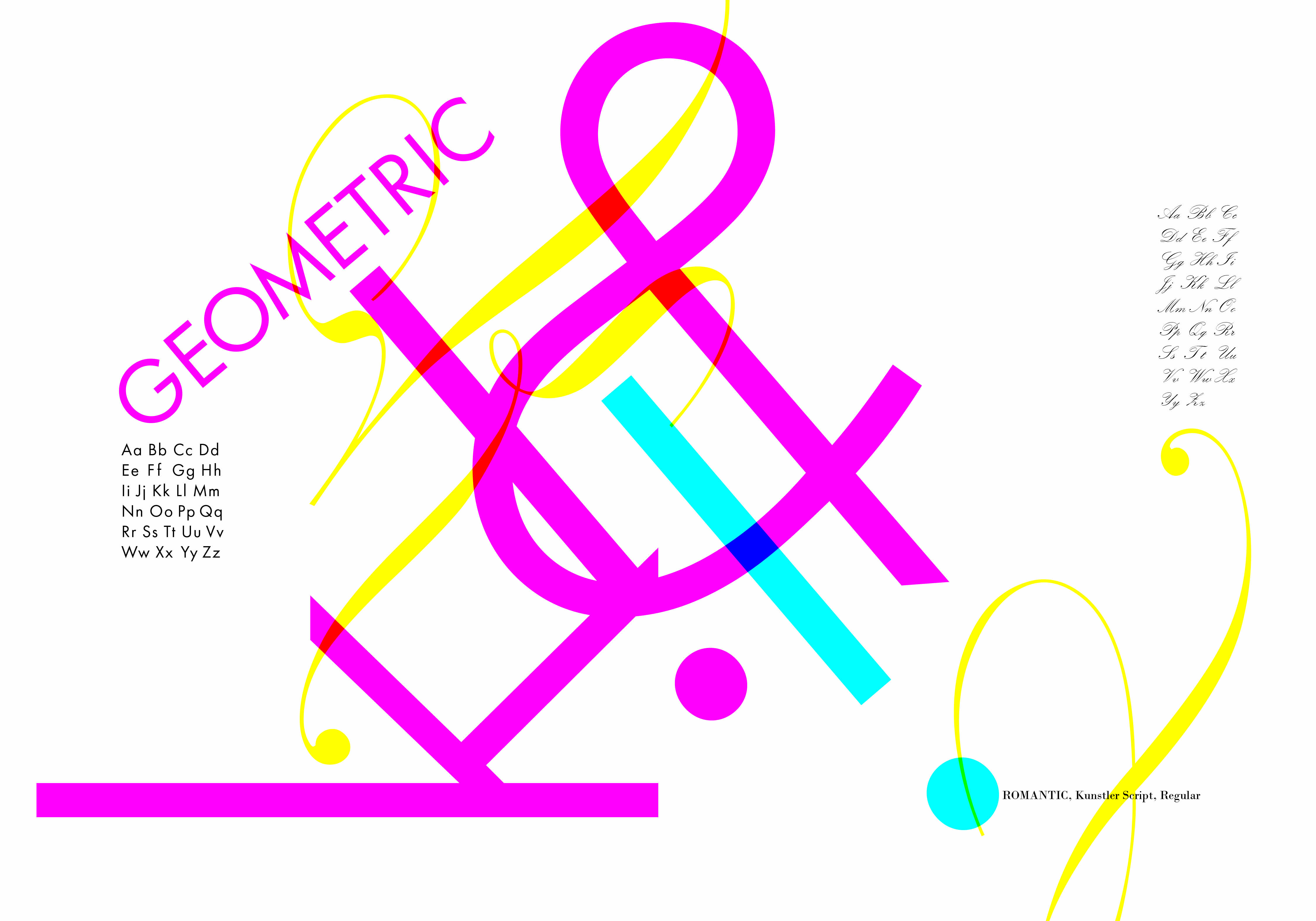
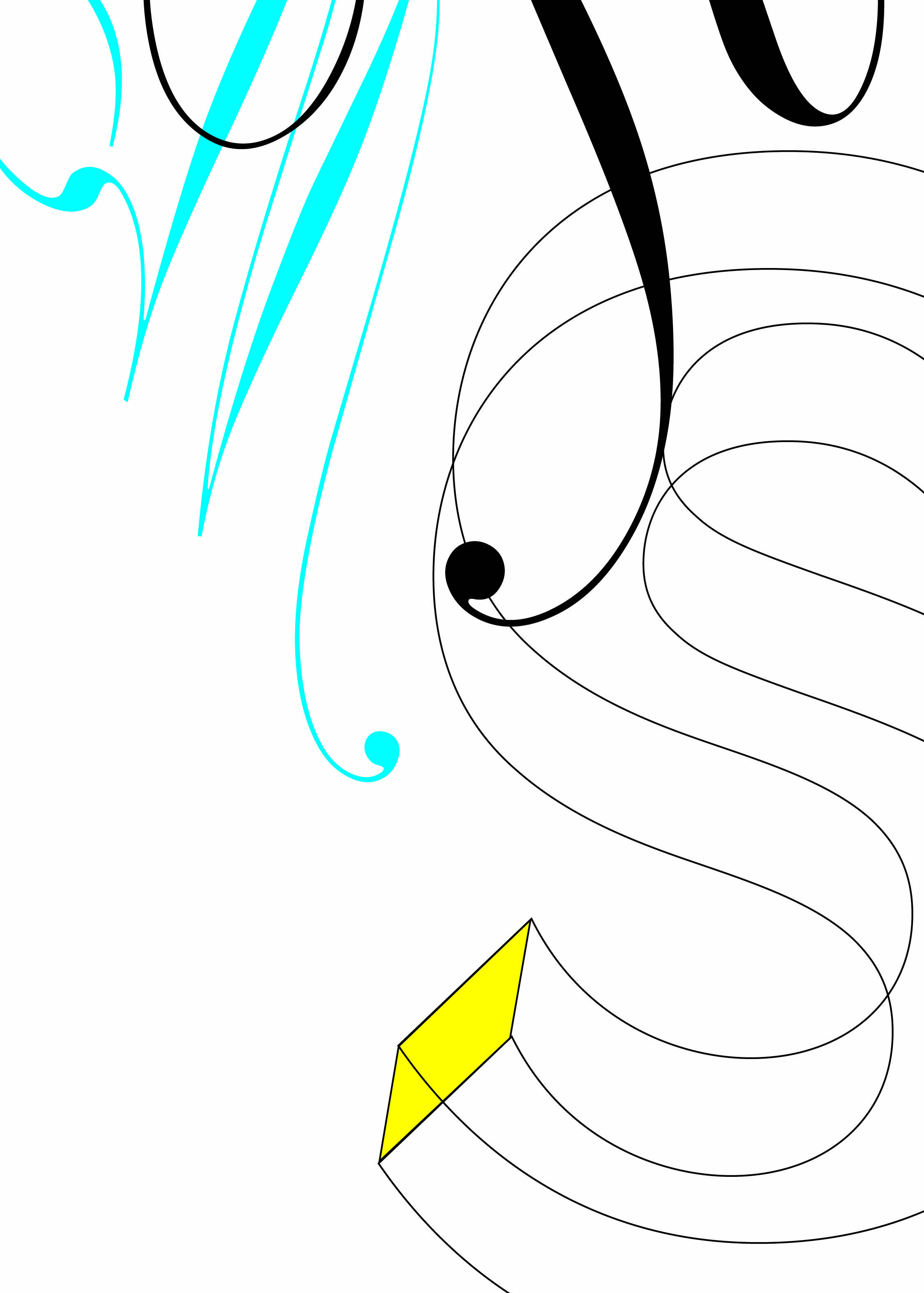
Romantic
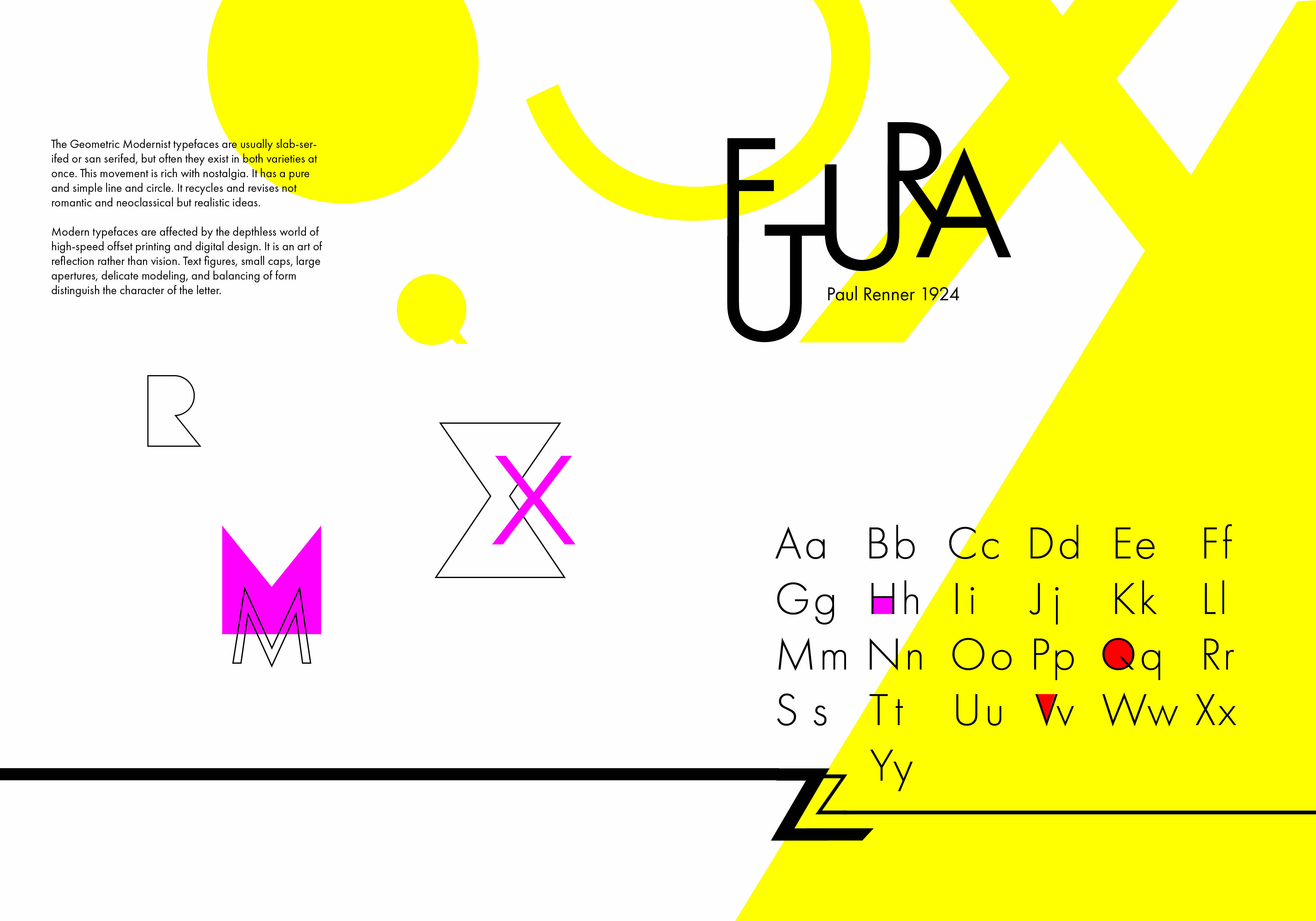
vs.
Modernist
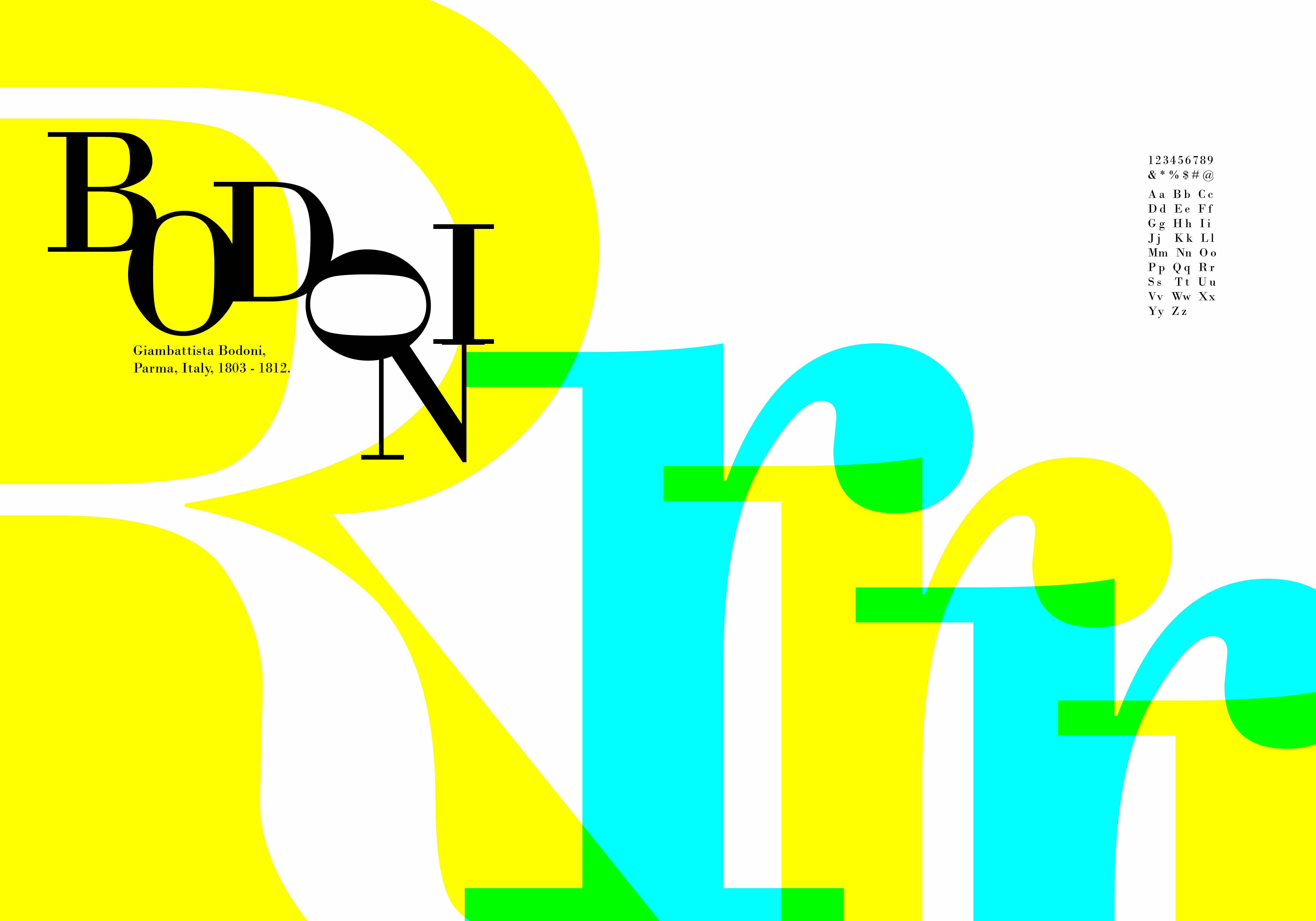
A 16-page Riso-printed typography book that explores two of Robert Bringhurst's type classifications — dramatizing their differences through letterform anatomy, color overlays, and Swiss-modernist composition.